It was real pleasure to support Ed Conway in putting together his detailed examination of 2020 mortality in historical context. I was hugely impressed with his engagement with the topic and how he got to grips with the metrics and was able to explain them to the public. I think that really comes across in this video.
For those who prefer the written word, the article below takes the reader on the same journey. It shows the various lenses by which we can view the pandemic’s impact on mortality.
And if you only have a couple of minutes, here are some highlights from Twitter.
First, excess deaths, comparing each year to the five years that preceded it (as per ONS).
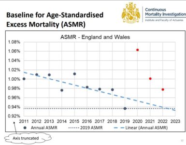
Next, age-standardised mortality rates.
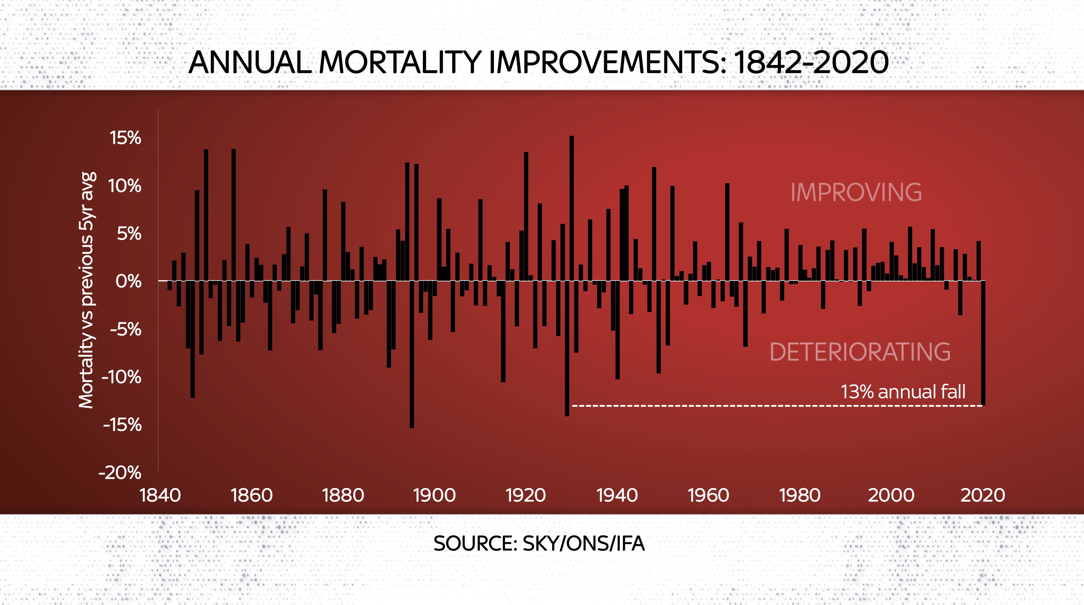
Finally, annual mortality improvement showing the 13% worsening in mortality between 2019 and 2020 – something not seen since 1929.

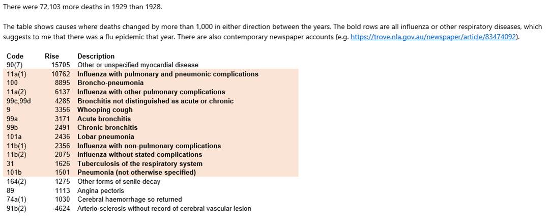
I’d like express my gratitude to the CMI, and in particular Jon Palin, for support pulling together the data and analysis. Jon even took some time to go through 90-year old cause of death data so we could validate what was driving the increases in deaths!

A very satisfying collaboration, taking actuarial analysis to a far wider audience than in usually the case!


