Note: An update to this blog is now available. We discuss concerns with the actual deaths used by the WHO as well as the issue with estimated expected deaths discussed here.
The World Health Organisation (WHO) recently reported 14.9 million excess deaths associated with the COVID-19 pandemic in 2020 and 2021. We have reviewed the WHO calculations and while the global total is broadly consistent with calculations by other organisations, we have concerns over the figures for some countries.
What are excess deaths?
The WHO describes excess deaths as “the difference between the number of deaths that have occurred and the number that would be expected in the absence of the pandemic”.
Why look at excess deaths?
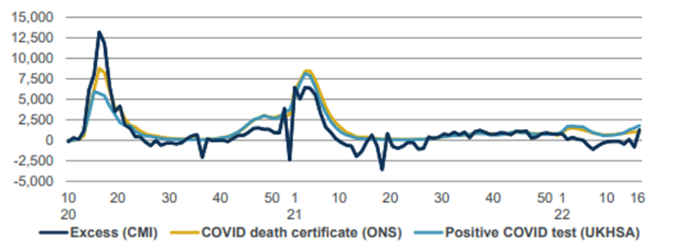
There are a number of ways to assess the impact of the pandemic. The CMI compares three approaches in its weekly mortality monitors, shown in Chart 1 for England & Wales:
- Excess deaths, which show the overall net impact of the pandemic on mortality
- Deaths where COVID is mentioned on the death certificate
- Deaths within 28 days of a positive test for COVID
There are significant differences between the three measures:
- At the peak of the first wave, in spring 2020, excess deaths were considerably higher than the other two measures. This is likely to reflect a lack of testing and some COVID deaths being missed at an early stage of the pandemic. While the UK has had an extensive testing programme through much of the pandemic, this is not true globally and excess deaths are valuable in showing the true picture.
- For much of the rest of the period, excess deaths in England & Wales have been somewhat lower than the other two measures, indicating that deaths attributed to causes other than COVID were below pre-pandemic levels.
Chart 1: Comparison of weekly measures of COVID-19 deaths for England & Wales

Source: CMI mortality monitor for week 16 of 2022 (data to 22 April 2022)
Methods for excess deaths
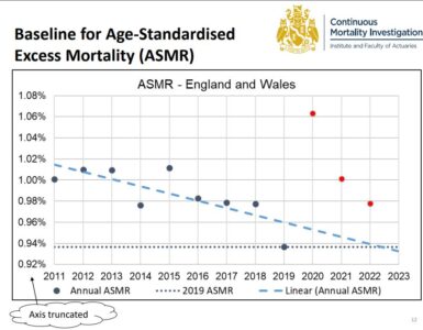
Excess deaths compare actual and expected deaths. While actual deaths rely on accurate reporting, this is an objective measure that we would expect to be fairly accurate (at least in developed countries). However, an estimate of expected deaths is subjective and different organisations have taken different approaches. The CMI’s measure of expected deaths is based on age-standardised mortality rates in 2019.
Concerns with the WHO method
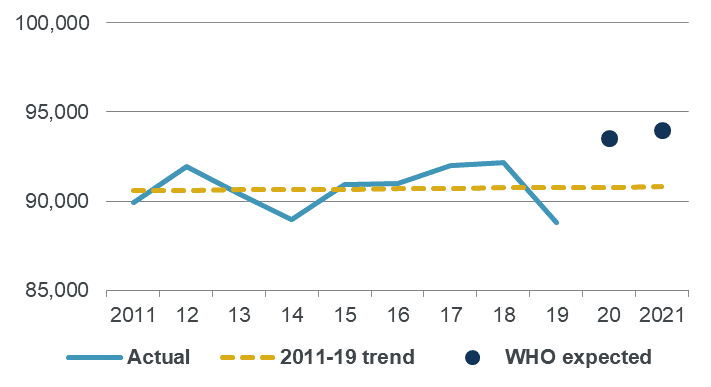
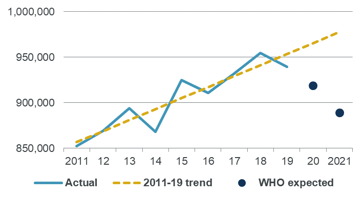
Charts 2 and 3 illustrate our concerns with the WHO calculations. We look at Sweden and Germany, as they show surprising results, and compare:
- Actual deaths from 2011 to 2019, using EuroStat data
- A linear fit to the 2011-2019 deaths
- The WHO expected deaths for 2020 and 2021
Chart 2: Actual and expected annual deaths for Sweden

Source: Own calculations, using EuroStat and WHO data
Chart 3: Actual and expected annual deaths for Germany

Source: Own calculations, using EuroStat and WHO data
Historical deaths for Sweden show some volatility from year to year, but the trend is broadly flat. However, the WHO expected deaths for 2020 and 2021 are both some way above the trend.
Historical deaths for Germany also show some volatility, but are fairly well modelled by an increasing linear trend. However, the WHO expected deaths are both a long way below the trend, particularly for 2021.
What went wrong?
Changes in deaths are affected by a combination of changes in mortality rates and changes in the size and age distribution of the population. The WHO approach projects deaths directly, which implicitly assumes that the impact of changes in populations are steady. This may not be an unreasonable assumption, particularly as most deaths occur at older ages where we wouldn’t expect sudden major changes.
The WHO method for these countries uses a combination of annual and seasonal splines to fit and project monthly deaths. While we haven’t tried to replicate this approach directly, our experience with similar methods suggests that the WHO approach is overly sensitive to random fluctuations, and places more weight on short term noise than the longer-term trend.
Impact of a simpler method for expected deaths
The subjective choice of a measure for expected deaths will directly affect the result for excess mortality. Table A shows how excess mortality for Sweden and Germany would differ if we used the linear trend as our measure of excess deaths, rather than the WHO figures. We are not saying that the linear trend is the ideal approach (see an earlier blog for the CMI’s preferred method, using age-standardised mortality rates) but it is simple to apply and appears plausible for these countries.
Table A: Excess mortality (as a percentage of actual) for 2020-2021
| Actual (WHO) | Expected (WHO) | Expected (linear) | Excess (WHO) | Excess (linear) | |
| Sweden | 198,777 | 187,524 | 181,568 | 6% | 9% |
| Germany | 2,003,549 | 1,808,561 | 1,943,162 | 11% | 3% |
The choice of measure for expected deaths makes a huge difference to the comparison between Sweden and Germany. Under the WHO approach, excess mortality in Germany was close to twice that in Sweden. But under the linear trend, excess mortality in Sweden is three times that in Germany.
Note: An update to this blog is now available. We discuss concerns with the actual deaths used by the WHO as well as the issue with estimated expected deaths discussed here.
Discussion
Differences in methods for excess deaths are less important when excess mortality is very high – such as at the peak of the first wave, when mortality in some countries was around twice normal levels. But these differences really matter when looking at periods when excess deaths are lower – such as in more recent times.
Comparisons between countries have the potential to inform government policy and public perceptions of measures taken to address this or future pandemics. It is therefore important that the calculations are reliable. For example, a recent article in the Daily Telegraph uses the apparently low WHO excess mortality figures for Sweden to question the benefits of lockdown. Our analysis suggests that the WHO may have understated excess mortality for Sweden, which calls a fundamental premise of the article into question.
Acknowledgements
A Twitter thread by Paul Mainwood alerted us to the unusual results for Sweden and Germany and prompted us to investigate the WHO approach.


